The new NTS website – where UX, copywriting and brand design meet
Brand
NTS
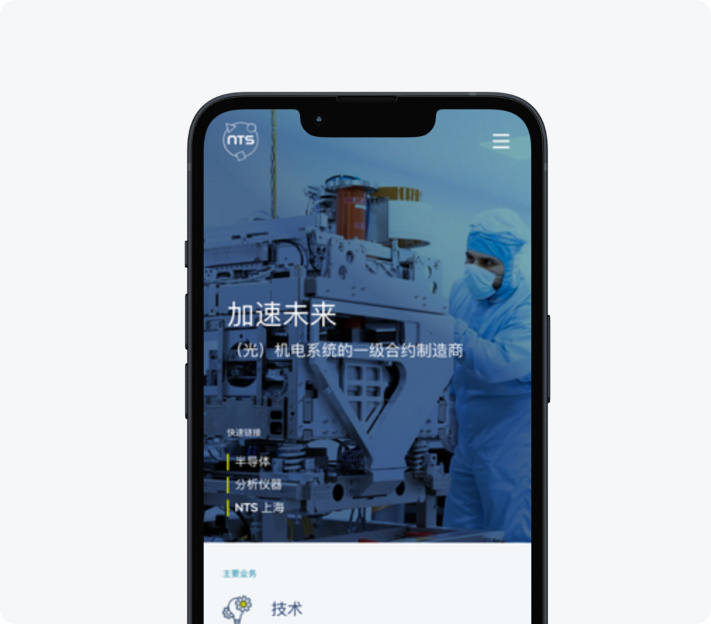
As a worldwide first-tier contract manufacturer in (opto-) mechatronic systems and mechanical modules, NTS takes the technological development of OEM customers to the next level.
“The great thing is that our new website not only contributes enormously to the NTS brand, but also generates more and better leads”
Stefan Martens, Head of Marketing & Internal Communications NTS
Global brand needs one cohesive identity
When a website needs updating, there are two choices. Do you choose to optimize the current website? Or do you go back to square one? To answer that question, you first get to the core of the customer’s ask. It’s always great to make it better, newer and more up to date. But a primary wish was to also coalesce the websites of all locations together into one. We also had the opportunity to work in tandem on a new corporate identity and tone of voice, based on NTS’s brand values. All of these beautiful tools, ready to start building with. Clearly there was more than enough to do here, which is why we chose option two.
Strategic UX
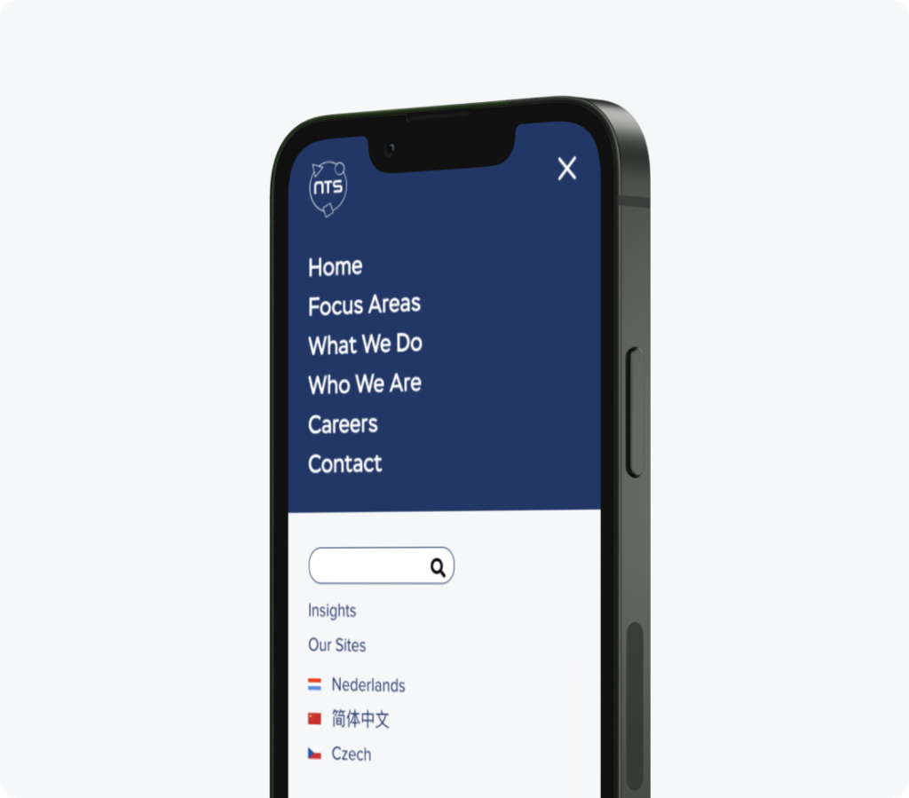
Rebuilding it is! Tabula rasa, a blank canvas. In the first phase, together with NTS, we took a critical look at the content of the website on a strategic level. Diving, reflecting and questioning. Which areas of expertise do we highlight? What do we excel in? And what makes it unique? We set up a new tree structure to tell the NTS story as completely as possible.
User-experience is an integrated part of this, not a next step. The website route remained in focus while determining the content. You want to optimize the customer journey, without compromising on the content. And that’s how you come up with the perfect wireframe. Once that is in place, design comes into play.
A house style revolution
NTS’ new brand identity? Not an overnight job. Over the past few years, we have worked on it together and intensively. The next step was to put it into action on a new website, with images, colors and movements that are in sync with the NTS brand. After all, how else do you convert brand values like “state-of-the-art,” “hands-on” and “approachable” into a visual brand experience? At the end of this phase, there was a website. But you still needed to replace ‘lorem ipsum’.

Don’t underestimate copy
Our content creators, who were waiting in the wings, could now finally spring into action and write all the texts for the English website. Though the first phase has already determined which markets, expertise and main topics will be covered, the content/text writing phase is just as important for the brand. Getting the hang of complex topics is one thing. But how do you transfer that knowledge into a text? How technical do you keep it? How will you approach the story? And how do you make sure the different locations don’t lose their uniqueness?
An intensive project, which would not have been a success without an equally intensive collaboration. And the result? Quite impressive, even if we say so ourselves.